#6 Read-Watch-Listen
Read
The Souls of Black Folk
By W.E.B. Du Bois
“When you have mastered numbers, you will in fact no longer be reading numbers, any more than you read words when reading books You will be reading meanings.” - W.E.B. Du Bois
There is a good chance you don’t know W.E.B. Du Bois, but maybe you’ve heard his name or maybe even recognised the title of one of his books. W.E.B Du Bois is a seminal figure in American history and this collection of essay is considered a cornerstone in American literature. Du Bois was one of the founders of the NAACP (National Association for the Advancement of Coloured People) and the first black man to gain a doctorate in the US. I read a few chapters of The Souls of Black Folk while at university and while I can’t remember any excerpts bit by bit it helped me better understand what was going on during American Reconstruction, and the repression of black people for decades that followed. To put Du Bois’ work into greater context, The Souls of Black Folk was published in 1903, 7 years after the Plessy v. Ferguson (separate but equal) was upheld in the Supreme Court, and 12 years before Birth of a Nation was screened at the White House.
While the essays aren’t super long (you can also listen to them via wikipedia), his writing is well worth the read. Du Bois had long disagreements with Booker T. Washington over separate but equal and so I’d recommend reading that chapter if you want to get a better sense for contemporary debates about Black America. The second “Dawn of Freedom” will give you a better context of Reconstruction and its failings. The essay “Spiritual Strivings” is poetry but if you want a bit of a shortcut there is this vid by The Atlantic.
As related to the Watch this week, you can read Du Bois’ data illustrations in his book: Visualising Black America
Watch
Mona Chalabi Recreates W. E. B. Du Bois’s Infographics with Modern Data
By Mona Chalabi, House of Illustration
Du Bois is considered a writer, historian, sociologist and activist. He collected a considerable amount of data and created eye catching graphs and charts to put the Black experience into visuals to tell a broader story, drawing people into the numbers that backed his writings about Black America. The Watch this week is Mona Chalabi recreating Du Bois’ graphs and chartsfrom the early 20th century and updating them with contemporary data. Mona Chalabi is a data illustrator and journalist who previously worked at fivethirtyeight and now works for the Guardian. Her work, like Du Bois, has a lot of focus on the inequalities and lack of progress in America. What I find eerie (and Mona says this as well) about Du Bois’ work is that not much has changed.
I recently took a data visualisation class, and it’s amazing how even the visuals for explaining data, hasn’t really gotten much better in over 100 years either - but maybe that is just human behaviour and cognition? While the visuals haven’t progressed, the tools we use have - Here is a link to all of the same data Du Bois captured but displayed in Tableau.
Data visualisation as a discipline is gaining more popularity because as we’ve progressed and become so fascinated and reliant on “the data” we need better tools to explain it and tell a narrative. Misinformation isn’t just a small group of armchair experts anymore, it is something that is pushed and circulated by even the most informed and well intentioned. People are paying a bit more attention to how one graph or visual can influence and persuade hundreds of thousands and are using it to their advantage. In the last year with the misinformation circulated about Qanon, US elections, and coronavirus among many other topics, it’s clear to see how easy it is to chip away at beliefs and even democracy with a simple graph.
Listen
Florence Nightingale and Her Geeks Declare War on Death
By Tim Harford, Cautionary Tales
When I watched the opening ceremonies of the 2012 Olympics* I didn’t really understand why there was such a long sequence celebrating nursing and national health care. It wasn’t until I moved here and absorbing Brexit campaigns that I truly realised why Britain’s NHS (national health service) goes beyond just a government service, it is a national institution in the same vein that Terry Fox or Hockey might be in Canada. Florence Nightingale is to the NHS is what Wayne Gretzky is to the NHL.
Florence Nightingale laid the foundation for professional nursing and is basically an all around bad ass. This week’s listen is a podcast about how Nightingale was “a total nerd” and how far ahead she was for her time, even before Du Bois, by using visualisations to persuade the public in 1859. “This is for the vulgar public” Nightingale said, recognising and asserting that most people don’t look at citations in a dry report. They need visuals to interpret and understand complicated data. Humans absorb information far faster and longer when it is visual - social media posts are far more likely to be shared, liked, and replied to when they have a photo, graph, or video attached to them. Unfortunately, graphs are often wide open for interpretation. Meaning, there are many instances where even the scientists themselves will under and over exaggerate the statistics in a graph - essentially reading it the data wrong due to the way it was visualised.
If graphs are so powerful, shouldn’t we be careful of how that power is used?
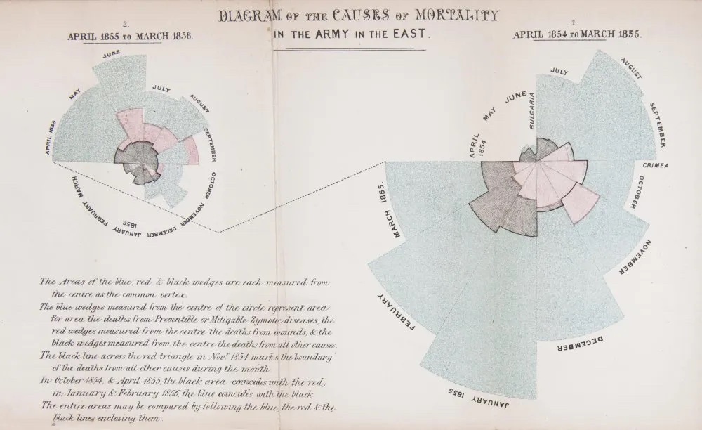
 Nightingale’s Rose Diagram of the Causes of Mortality in the army in the east - a before and after comparison relating to the sanitary commission, from April to March 1845-55 and 1855-56
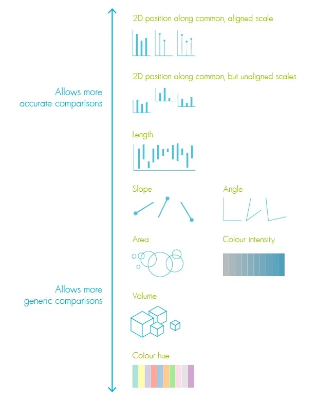
Florence Nightingale’s polar area diagram of Crimean war mortality Nightingale’s Rose Diagram of the Causes of Mortality in the army in the east - a before and after comparison relating to the sanitary commission, from April to March 1845-55 and 1855-56 There is a hierarchy for how people can understand data - bar charts are the best, as it is the easiest way for us to understand data through comparison. This is the crux of the episode - the data in Nightingale’s beautiful rose diagram looks starkly different when presented in a bar graph, deaths were already falling before her sanitary commission initiative came in. Meaning, her efforts would have been dampened if she had used a bar graph. And while all of the efforts made by Nightingale were good and proven so, the podcasts leaves you, not with a happy ending but a question - do the ends justify the means?

7 Reasons You Should Use Dot Graphs, by Maarten Lambrechts – paulvanderlaken.com Cleveland McGill Hierarchy
*I totally forgot how weird and wonderfully British the 2012 Olympic Ceremonies were and how creepy giant pantomimes are…